- Disruption of HF Comms: D-Region Absorption
- Disruption of HF Comms: Ionospheric Storm
- Disruption of Satellite Communications and Navigation
- Basic Parameters (X-rays, in-situ particles and solar wind)
- Indices (Kp, Dst) & Summary Plots
Disruption of HF Comms: D-Region Absorption
Short Wave Fade (SWF) Event
The plots below shows examples of the operational impact of a Short Wave Fade event on HF radio communication. They are the results of codes produced by NOAA/SEC and IPS that try to predict the extent and intensity of the absorption in an event - (two different events are shown).HAF Prediction produced by NOAA/SEC
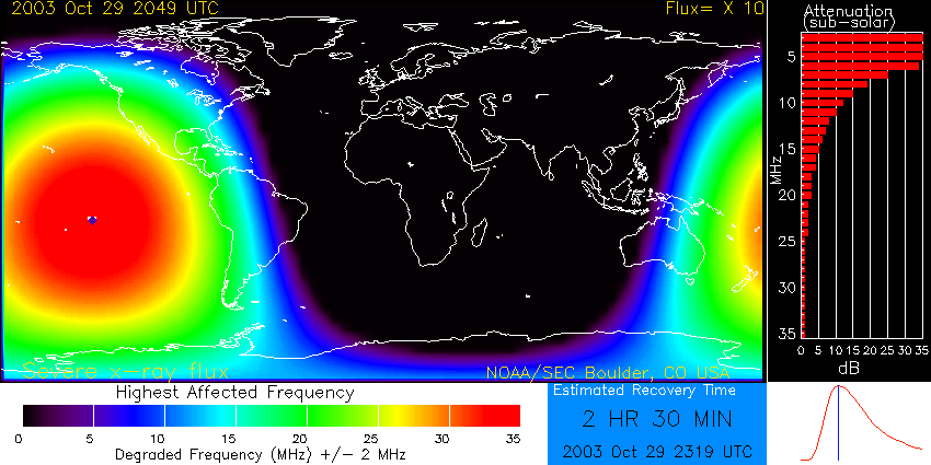 The map in this plot graphically illustrates the
Highest Affected Frequency (HAF) - the frequency that suffers a loss of 1dB during a
vertical propagation from ground, through the ionosphere, and back to ground - as a
function of latitude and longitude. The value of HAF is calculated at the
sub-solar point based on the ambient solar X-ray (1-8 Å) flux using an
empirical formula giving the relationship between X-ray flux and degraded
frequency; the values at other geographic locations are scaled by the solar zenith angle.
The map in this plot graphically illustrates the
Highest Affected Frequency (HAF) - the frequency that suffers a loss of 1dB during a
vertical propagation from ground, through the ionosphere, and back to ground - as a
function of latitude and longitude. The value of HAF is calculated at the
sub-solar point based on the ambient solar X-ray (1-8 Å) flux using an
empirical formula giving the relationship between X-ray flux and degraded
frequency; the values at other geographic locations are scaled by the solar zenith angle. The plot also displays some additional information. The bar graph on the right-hand side of the graphic displays the expected attenuation in decibels as a function of frequency for vertical radio wave propagation. The digital clock near the lower right corner displays the Estimated Recovery Time to normal background conditions, based on an empirical relationship between flare size and duration.
More information on how the plot was produced can be found on the NOAA/SEC site.
ALF Prediction produced by IPS
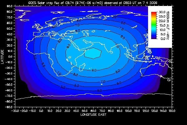 The map shows the Absorption Limited Frequency (ALF) - the lowest frequency
able to propagate for HF circuits typically 1500 km in length
- as a function of latitude and longitude.
Again the value is calculated at the sub-solar point based on the ambient solar X-ray flux and
values at other geographic locations are scaled by the solar zenith angle.
The map shows the Absorption Limited Frequency (ALF) - the lowest frequency
able to propagate for HF circuits typically 1500 km in length
- as a function of latitude and longitude.
Again the value is calculated at the sub-solar point based on the ambient solar X-ray flux and
values at other geographic locations are scaled by the solar zenith angle.
To use the plot, work out the approximate location where your circuit is being reflected by the ionosphere and estimate the value of the ALF from the contours. If the frequency you wish to use is lower than this value then communication is unlikely; if it is higher than the ALF then communication is still possible. For circuits shorter that 1500 km, the ALF values from the map are likely to be too high and communications will still be possible for slightly lower frequencies. For much longer circuits, slightly higher frequencies than the suggested ALF can still be affected by the fadeout.
More information about the plot can be found on the IPS site.
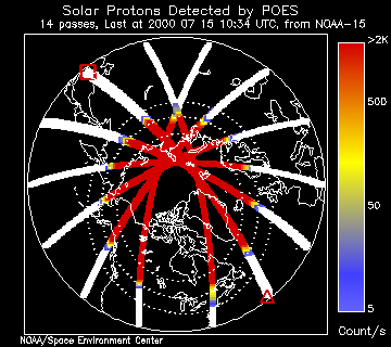
Polar Cap Absorption (PCA) Event
 There are currently no operational codes for predicting the effect
of a PCA event, but NOAA's Polar Orbiting Environmental Satellites
(POES) carry proton detectors similar to those on GOES and these
data can be used to map where proton precipitation is occurring
during a solar particle event (SPE). This also provides an
indication of those HF radio propagation paths will be badly
degraded because of the signal absorption.
There are currently no operational codes for predicting the effect
of a PCA event, but NOAA's Polar Orbiting Environmental Satellites
(POES) carry proton detectors similar to those on GOES and these
data can be used to map where proton precipitation is occurring
during a solar particle event (SPE). This also provides an
indication of those HF radio propagation paths will be badly
degraded because of the signal absorption.The plot of POES data is designed to provide an up-to-date picture of the extent of the Northern polar area being affected. Each POES spacecraft transits a polar region twice each orbit and can provide a direct measure of the boundaries and extent of the solar proton fluxes entering the atmosphere during an SPE.
The beginning of the most recent spacecraft transit is marked with a red square and its end with a red triangle. Data plotted in white indicates insignificant count rates. The universal time at the start of the pass is given in the caption along with the name of the satellite providing the information.
More information on how the plot was produced can be found on the NOAA/SEC site.
Disruption of HF Comms: Ionospheric Storm
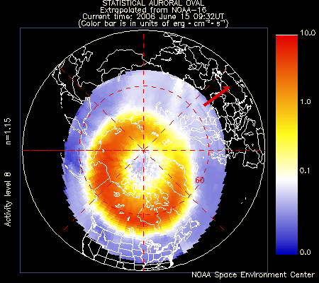
Auroral Activity
 This plot shows the current extent, position and intensity of the auroral oval in the northern
hemisphere, extrapolated from measurements taken during the most recent polar pass of
the NOAA POES satellite.
This plot shows the current extent, position and intensity of the auroral oval in the northern
hemisphere, extrapolated from measurements taken during the most recent polar pass of
the NOAA POES satellite.The statistical pattern depicting the auroral oval is appropriate to the auroral activity level determined from the power flux observed during the most recent polar satellite pass. The power fluxes in the pattern are color coded on a scale from 0 to 10 ergs .cm-2.sec-1 according to the color bar on the right. The pattern has been oriented with respect to the underlying geographic map using the current universal time, updated every ten minutes.
A normalization factor of less than 2.0 indicates a reasonable level of confidence in the estimate of power. The more the value of n exceeds 2.0, the less confidence should be placed in the estimate of hemispheric power and the activity level. The red arrow in the plot, that looks like a clock hand, points toward the noon meridian.
More information on how the plot was produced can be found on the NOAA/SEC site.
Auroral Power
This page is still under development...
Disruption of Satellite Communications and Navigation
Satellite communication and navigation systems are both affected by conditions in the ionosphere:- The quality of communications can be disrupted if the Total Electron Content (TEC) is too high, or if there is scintillation.
- Position resolution provided by Satellite Navigation systems such as GPS (and Galileo) can be degraded by high TEC (the signal is refracted and the extra path length causing timing errors) and by scintillation (the receiver can loose lock).
TEC Map
Several organizations publish maps of the ionospheric Total Electron Content (TEC) - IPS, JPL and RAL. The major difference between the maps is the source of the data used to produce them. IPS uses real time foF2 data from a network of stations to drive the IRI2001 ionospheric model from which TEC is extracted. JPL and RAL use GPS observables from a network of dual frequency GPS receivers with their own mapping algorithms to derive their global TEC maps. While the gross features of GPS derived and data-driven model derived TEC are usually comparable, the absolute level of Vertical TEC at any one point may vary - this is evident in the differences in the three maps. The JPL Map was chosen for these pages because of the currency of the plot.Scintillation Map
The map shows the location of GPS perturbations suspected to be caused by ionospheric scintillation. The scintillation index is plotted for each measurement - this is deduced from high frequency GPS phase fluctuations with empirical normalization. Where scintillation is greatest, GNSS is likely to have position degradation as receivers could loose lock on individual spacecraft. The plot was generated by the SOARS project using data provided by the Ionospheric Scintillation Monitoring Service, (an ESA Space Weather Pilot Project SDA led by CLS, France).The number of stations used to gather the GPS data does not provide complete global coverage - the effect of this can clearly be seen on plot of the whole world. At high latitudes, the area showing greatest scintillation on this plot appears to match that shown on the POES auroral activity extrapolation plots.
Basic Parameters (X-rays, in-situ particles and solar wind)
GOES X-rays
This GOES X-ray flux plot contains 5 minute averages of solar X-ray output in the 1-8 Angstrom (0.1-0.8 nm) and 0.5-4.0 Angstrom (0.05-0.4 nm) passbands. Data from both operational GOES satellites are included. Some data dropouts will occur during satellite eclipses. SEC alerts are issued at the M5 (5x10E-5 Watts/m2) and X1 (1x10E-4 Watts/m2) levels, based upon 1-minute data. Large X-ray bursts cause short wave fades for HF propagation paths through the sunlit hemisphere. Some large flares are accompanied by strong solar radio bursts that may interfere with satellite downlinks.More information on how the plot was produced can be found on the NOAA/SEC site.
GOES in-situ Data
The GOES spacecraft are (terrestrial) weather satellites that also carry intruments to monitor information relevent to space weather. There are normally two operational GOES spacecraft in geostationary orbits, stationed above the east and west coast of the US at longitudes (approx) W75 and W135 (currently GOES-12 ia at W75 and GOES-10 at W135); spare spacecraft are kept in orbit ready for use.Because the GOES satellites are geostationary, during a 24 hour interval they sweep through different parts of the magnetosphere. This can be seen as a modulation in the electron data (and the proton data on some spacecraft) - since the two spacecraft are at different longitudes there is a phase shift between the curves. On the plots of these data produced by SEC the times of local midnight and noon for each spacecraft are marked with the letters M and N.
Protons
This proton flux plot contains the 5-minute averaged integral proton flux (protons/cm2-s-sr) as measured by GOES for energy thresholds of >=10, >=50, and >=100 MeV. SEC's proton event threshold is 10 protons/cm2-s-sr at >=10 Mev. Large particle fluxes have been associated with satellite single event upsets (SEUs).More information on how the plot was produced can be found on the NOAA/SEC site.
Electrons
This electron flux plot contains the 5-minute averaged integral electron flux (electrons/cm2-s-sr) with energies greater than or equal to 0.6 MeV and greater than or equal to 2 MeV at the two GOES spacecraft. Enhanced fluxes of electrons for an extended period of time have been associated with deep dielectric charging anomalies. These data are invalid during a significant proton event because of sensor contamination at the GOES spacecraft.More information on how the plot was produced can be found on the NOAA/SEC site.
Magnetic field
The GOES Hp plot contains the 1-minute averaged parallel component of the magnetic field in nano-Tesla (nT), as measured at the two GOES spacecraft. The Hp component is perpendicular to the satellite orbit plane and Hp is essentially parallel to Earth's rotation axis. If these data drop to near zero, or less, when the satellite is on the dayside it may be due to a compression of Earth's magnetopause to within geosynchronous orbit, exposing satellites to negative and/or highly variable magnetic fields. On the nightside, a near zero, or less, value of the field indicates strong currents that are often associated with substorms and an intensification of currents in the Earth's geomagnetic tail. Default scaling is 0 to 200 nano-Tesla. Non-default scaling to include infrequent extreme values is labeled in red to emphasize the change in scale.More information on how the plot was produced can be found on the NOAA/SEC site.
ACE in-situ Data
The ACE (Advanced Composition Explorer) spacecraft is in orbit around the L1 point - this is a region of space where the strength of Earth and Sun's gravitational fields are equal and lies around 1.5 million kilometers towards the Sun from the Earth.ACE returns a continuous (low-bandwidth) stream of real-time data containing parameters important to space weather. Because of the location of the spacecraft, ACE experiences the passage of phenomena up to one hour before they reach the Earth's magnetosphere. In some industrial sectors, this advanced warning provides sufficient time to prepare for the effects of space weather phenomena.
Interplanetary Magnetic Field (IMF)
Solar Wind Speed and Density
Particles: Protons and Electrons
Indices (Kp, Dst) & Summary Plots
Kp Index
Kp is an index that is commonly used to characterize the global planetary geomagnetic disturbances caused by the solar wind over a 3-hour period - values of 5 or greater indicate storm-level geomagnetic activity.The planetary index Kp is the mean standardized K-index from 13 geomagnetic observatories between 44 degrees and 60 degrees northern or southern geomagnetic latitude. The K-index is quasi-logarithmic local index of the 3-hourly range in magnetic activity relative to an assumed quiet-day curve for a single geomagnetic observatory site.
Many models of the near-Earth space environment rely on Kp indices to indicate the severity of the space environment. Since the official Kp index is published with a significant time delay, several groups use in-situ data (IMF, solar wind speed and density) from the ACE spacecraft to predict Kp.
For more information see the SEC Kp index page, NGDC Kp index page.
Dst Index
The Dst or Disturbance Storm Time index is a measure of geomagnetic activity used to assess the severity of magnetic storms. High Dst values indicate a calm magnetosphere and low Dst values indicate the occurrence of a geomagnetic storm.Dst is expressed in nano-Tesla and is based on the average value of the horizontal component of the Earth's magnetic field measured hourly at four near-equatorial geomagnetic observatories. The use of the Dst as an index of storm strength is possible because the strength of the surface magnetic field at low latitudes is inversely proportional to the energy content of the ring current, which increases during geomagnetic storms.
Since the official Dst index is published with a significant time delay, several groups use in-situ data (IMF, solar wind speed and density) from the ACE spacecraft to predict Dst.
For more information see the SWRI Dst page
Solar Wind Summary Plot
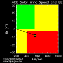 This diagram is produced using real-time data from the ACE
spacecraft - it summarized the current values of the solar wind speed, the
strength of the interplanetary magnetic field (IMF) in a
north/south direction and the solar wind density.
This diagram is produced using real-time data from the ACE
spacecraft - it summarized the current values of the solar wind speed, the
strength of the interplanetary magnetic field (IMF) in a
north/south direction and the solar wind density. The position of the black square gives the value of the solar wind speed (horizontal) axis and the strength of the interplanetary magnetic field in a north/south direction (Bz - vertical axis). Higher solar wind speeds and strong south pointing (negative) IMF are associated with geomagnetic disturbances on Earth. The red area on the image indicates an approximate region in which disturbed conditions might be expected. The coloured dot within the black square, is an indicator of solar wind density, and is yellow when density exceeds 5 particles per cubic cm, red when density exceeds 10 particles per cubic cm, otherwise green.
For more information see the IPS Solar WInd summary
Three Zone Plot
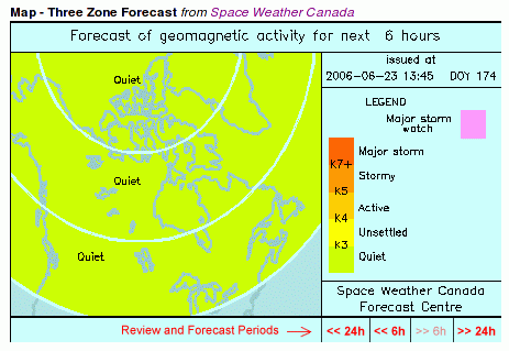 The levels of geomagnetic field activity, or disturbance, currently used in the short-term
forecasts are labelled qualitatively for general usage.
For each of the three major zones
(subauroral, auroral, polar cap), the range of activity typically experienced in the zone
is subdivided into five classifications: quiet, unsettled, active, stormy, major storm -
the actual boundaries in terms of field intensity vary from zone to zone.
needs more...
The levels of geomagnetic field activity, or disturbance, currently used in the short-term
forecasts are labelled qualitatively for general usage.
For each of the three major zones
(subauroral, auroral, polar cap), the range of activity typically experienced in the zone
is subdivided into five classifications: quiet, unsettled, active, stormy, major storm -
the actual boundaries in terms of field intensity vary from zone to zone.
needs more...For more information see the Space Weather Canada - Short-term Magnetic Forecasts
This page is still under development...